R U DTF?
![]()
My appreciation for good advertising and design skyrocketed the moment I saw the OK Cupid, DTF campaign. These whimsically beautifully orchestrated photos paired wonderfully with a pun or sort of inside joke for people engaging with the ads by reading them. If you did not want to read however, the images could stand alone as an entirely different entity because they were stunning. I chuckled to myself as I scanned the subway car for more content. I thought it was so cool that a seemingly ordinary dating company rolled out ads that were youthful and promiscuous if you will. I felt as though it was one of the first times I had seen an ad of this nature. I was amazed and humbled by this ingenious idea. The term DTF was re-branded into something fun, relatable, and cute. It did not just mean down to ****, it now encapsulated so much more than that. This campaign reached new levels of intimacy.
I headed to the lovely interwebs to investigate the brains behind the operation and found out it was none other than the infamous W+K. It makes sense that a major design firm pulled this off but I will say part of my shock level came from the fact that an agency as big and well known as WK was taking such a fun stance on the typical hush hush nature of the term DTF. This is really the design that cemented my awareness that I belonged in the graphic design world.
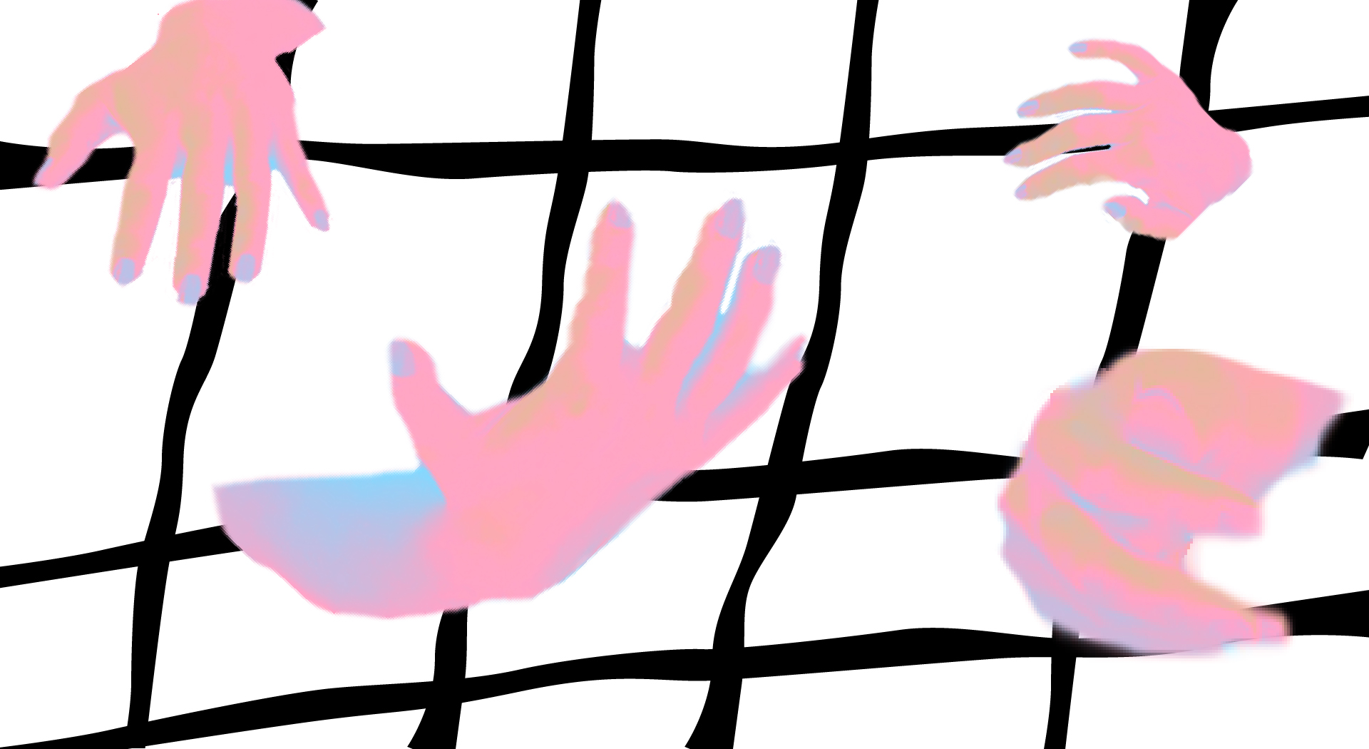
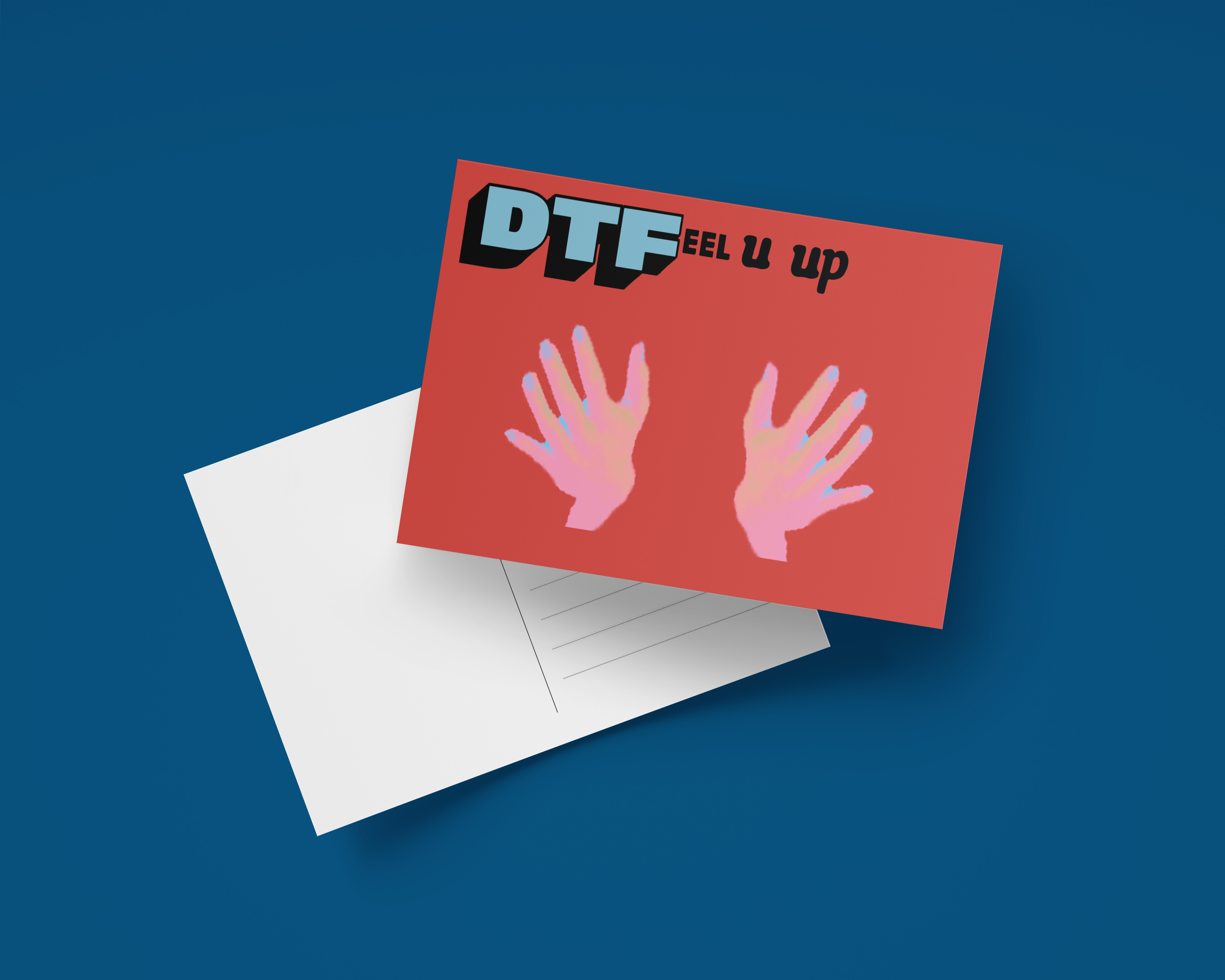
To honor my love for this campaign, I made fifty iterations of one of the original posters using only components of said poster. Then, I turned my favorites into postcards. The idea behind the postcards is they would be sent to OK, Cupid members to give out after their dates with people they met through the app. This project is not for the faint of heart which is maybe why I enjoyed working on it so much. It sort of disrupted a system in its own way and I can stand behind that.
![]()
